Website Conversion Optimization: A Practical Guide to More Efficient Growth
Website conversion optimization is the disciplined process of turning more qualified visits into revenue without assuming that a new button color will solve a broken acquisition system. In 2026, the practical outcome is bigger: you should be able to identify where intent is being lost, connect improvements to contribution margin and customer lifetime value, and create a test roadmap your team can execute with confidence.
This guide gives growth-stage brands a concrete operating method. You will leave with a measurement plan, a prioritization table, a worked ecommerce example, and a sequence for improving landing pages, forms, checkout, and post-click media efficiency. The goal is not to chase an impressive conversion rate in isolation. It is to improve the quality and economics of the customers your website generates.
Define the conversion system before changing the page
Start by describing the customer journey as a system rather than a collection of pages. A paid social visitor who purchases after viewing a product page has taken a different path from a returning customer who searches for a brand name, opens a comparison page, and requests a sales consultation. Combining those journeys into one website conversion rate can hide the real constraint.
Write down the business outcome first, then the observable actions that lead to it. For an ecommerce company, the primary outcome may be profitable first orders. For a B2B company, it may be sales-qualified opportunities rather than form fills. For a subscription brand, it may be a completed subscription with an acceptable projected lifetime value.
- Primary conversion: the event that most directly creates revenue, such as a completed purchase or qualified opportunity.
- Secondary conversion: a meaningful step that predicts progress, such as an add-to-cart, product quiz completion, or booked meeting.
- Quality signal: an attribute that tells you whether the conversion is economically useful, such as margin tier, lead fit, repeat purchase potential, or sales acceptance.
- Failure event: a point where users abandon, encounter an error, hesitate, or return to comparison shopping.
Separate volume problems from value problems
A landing page can generate more leads while making the business worse if lead quality falls. Similarly, a promotion can increase order volume while reducing margin or attracting customers who never purchase again. Your measurement plan therefore needs both behavioral events and commercial outcomes.
For a lead-generation funnel, connect submitted forms to downstream statuses such as contacted, qualified, opportunity, and closed revenue. For ecommerce, connect sessions and product interactions to order value, gross margin where available, refunds, discounts, and repeat purchase behavior. Google Analytics documentation describes recommended events and event collection as part of its measurement model; use the official guidance to distinguish meaningful business events from arbitrary click tracking. Google’s event documentation is a useful reference when defining that event taxonomy.
Do not treat every interaction as a success merely because it is easy to count. A video play may be useful for diagnosing engagement, but it should not outrank a completed checkout when deciding where to allocate engineering time.
Set the baseline with a consistent denominator
Choose denominators that match the question. Use sessions or users when assessing page behavior, but use qualified leads, orders, or revenue when assessing commercial performance. If paid campaigns send different audiences to different experiences, report results by traffic source and landing-page intent, not only as a site-wide average.
An illustrative starting policy is to review at least four weeks of data before declaring a stable baseline, unless traffic is so low that a longer period is required. Adjust that policy when seasonality, promotions, inventory changes, or campaign launches materially alter the mix. The signal to extend the window is a changing audience or purchase pattern; the signal to shorten it is a planned business change that makes older data no longer representative.
Diagnose the highest-value friction in the funnel
Once the measurement map exists, locate the first meaningful break in the journey. Do not begin with a page redesign because the homepage feels dated. Begin with evidence that a specific step is suppressing qualified demand.
Build a funnel that reflects the customer’s actual decisions. An ecommerce version might be:
- Qualified landing-page visit
- Product or category engagement
- Add to cart
- Checkout start
- Payment completion
- Profitable first order
A B2B version might be:
- Target-account visit
- Solution or proof-page engagement
- Form start or calendar start
- Completed inquiry
- Sales acceptance
- Opportunity or revenue
For each stage, calculate the next-step rate and inspect the absolute number of people lost. A high percentage drop at a low-volume step may be less valuable than a moderate drop at a high-volume step. Also examine whether the lost users are valuable prospects or low-intent traffic.
Use qualitative evidence to explain quantitative gaps
Analytics can show that checkout completion is weak; it cannot always tell you whether users distrust shipping costs, cannot find a payment method, or are blocked by an address-validation error. Combine:
- Behavioral data: funnel progression, device type, browser, campaign, geography, new versus returning status, and page speed.
- On-site evidence: search terms, support conversations, chat transcripts, form abandonment, and survey responses.
- Session evidence: recordings or heatmaps used carefully, with privacy controls and without treating attention maps as proof of intent.
- Commercial evidence: sales objections, refund reasons, product returns, and lead-quality feedback.
Google’s page experience guidance identifies loading performance, interactivity, and visual stability as important user-facing dimensions. Use those signals diagnostically rather than assuming that a technical score alone predicts revenue. PageSpeed Insights documentation explains how performance assessments are used and can help your team separate a measurable speed issue from a speculative redesign request.
Look for mismatch, not just friction
Many “conversion problems” are actually message-to-intent mismatches. A prospect searching for “enterprise inventory software” should not land on a generic feature page written for small businesses. A paid social visitor responding to a creative promise about free shipping should see that promise confirmed immediately, not after several scrolls.
Audit each important entry path for continuity:
- Does the ad or referral promise appear in the first screenful?
- Does the page make the next action obvious for that visitor’s intent?
- Are proof points relevant to the claimed outcome?
- Are price, shipping, availability, or qualification requirements revealed early enough?
- Does the page answer the likely objection before asking for commitment?
Prioritize opportunities by economics and confidence
After diagnosis, create a backlog that forces trade-offs. “Improve mobile UX” is not an actionable hypothesis. “Reduce uncertainty about delivery timing on mobile product pages to increase checkout starts among paid search visitors” is specific enough to design, measure, and challenge.
Score opportunities using four dimensions: potential impact, evidence strength, implementation effort, and strategic value. Keep the scoring simple enough that channel, creative, engineering, and commercial leaders can disagree productively.
| Opportunity | Observed signal | Hypothesis | Effort | Primary measure | Guardrail |
|---|---|---|---|---|---|
| Shipping information on product pages | High product views but weak checkout starts on mobile | Showing delivery timing near the purchase control will reduce uncertainty | Low | Checkout-start rate | Gross margin per visitor |
| Lead form qualification fields | Many submissions, low sales acceptance | Replacing low-value fields with one useful fit question will improve lead quality | Medium | Qualified-lead rate | Form completion rate |
| Paid social landing page | Strong click-through, weak engaged sessions | Matching the ad’s audience and promise will improve post-click relevance | Medium | Qualified session rate | Cost per qualified visit |
| Checkout error handling | Payment failures concentrated in one browser or method | Clear error recovery and an alternate payment route will recover valid demand | High | Successful payment rate | Refund and support rate |
Turn scores into testable hypotheses
Use this format: For [audience] arriving from [context], changing [experience] should improve [behavior] because [mechanism], without harming [guardrail]. The mechanism matters. It prevents your team from interpreting any movement as proof that the change was strategically correct.
An illustrative starting policy is to score impact, confidence, and effort from 1 to 5, then investigate the highest combined opportunities first. This is not a universal prioritization formula. Adjust it when a low-score technical defect blocks revenue, when a high-impact idea lacks evidence, or when the roadmap is constrained by release dependencies.
Prioritization should also include opportunity cost. A small copy change may be attractive because it is easy, but if it consumes the only analytics engineering slot needed to repair revenue attribution, it may be the wrong first move.
Improve the experience in the order users make decisions
Optimization works best when the page answers questions in sequence. Visitors typically need to understand what is being offered, decide whether it is relevant, assess whether they can trust the claim, resolve practical objections, and then complete an action. The exact sequence varies by category, but removing one question does not remove the need for an answer.
Strengthen the first decision: relevance
Make the initial proposition specific to the audience and traffic context. A strong headline communicates the outcome, category, or differentiator without forcing the visitor to decode internal brand language. Supporting copy should clarify who the offer is for and what happens next.
For a paid campaign, preserve message continuity between creative, landing page, and next action. This does not mean repeating identical copy everywhere. It means maintaining the same promise, audience, and expectation. If an ad emphasizes speed but the page emphasizes customization, the visitor must reconcile that difference before acting.
Strengthen the second decision: confidence
Proof should address the risk the customer actually perceives. Logos may establish familiarity, but a technical buyer may need implementation detail. A consumer may need reviews, returns information, and delivery clarity. A founder buying an agency service may need to understand reporting, decision rights, and how testing connects to revenue.
- Use specific evidence near the claim it supports.
- Explain constraints instead of hiding them behind vague superlatives.
- Show the product, process, or result in the context where the decision occurs.
- Make guarantees and policies easy to verify.
- Remove testimonials that are too generic to reduce perceived risk.
Accessibility is part of confidence and completion, not merely a compliance exercise. Semantic labels, keyboard access, readable contrast, and clear error states help more people understand and operate the interface. The W3C Web Content Accessibility Guidelines provide the formal success criteria your design and development teams can use when reviewing interactive journeys.
Strengthen the final decision: action
Use a primary call to action that describes the next step accurately. “Get started” may be appropriate when the user understands the commitment; “See delivery options” may be better when shipping uncertainty is the barrier. A form that asks for a phone number, company size, budget, and timeline should explain why those fields are necessary.
Do not use urgency, scarcity, or discount framing to conceal material information. Those tactics may lift an immediate action while damaging trust, margin, or future retention. Measure conversion quality after the click, not only the click itself.
Remove form and checkout failure points
Forms and checkout flows are where accumulated uncertainty becomes an observable business loss. Every field, validation rule, redirect, and payment dependency creates another opportunity for a motivated customer to stop.
First classify each field by its job:
- Routing field: sends a lead to the correct team or experience.
- Qualification field: predicts fit or likely commercial value.
- Operational field: is required to fulfill, bill, or contact the customer.
- Research field: is interesting but not necessary for the current transaction.
Remove research fields from the first conversion unless their value clearly outweighs the abandonment they create. If sales needs information, consider progressive qualification after the initial inquiry, enrichment where lawful and accurate, or a conversational follow-up process.
Design error recovery, not just validation
An error message should identify what failed, explain how to fix it, preserve the information already entered, and make the next action obvious. “Invalid input” is not recovery. “Enter a 10-digit phone number, including area code” gives the user a path forward.
Test:
- Keyboard-only completion
- Autofill and password-manager behavior
- Slow network conditions
- Expired sessions and back-button behavior
- Invalid addresses and unavailable inventory
- Declined payment methods and duplicate submissions
- Mobile browsers with obstructed keyboards
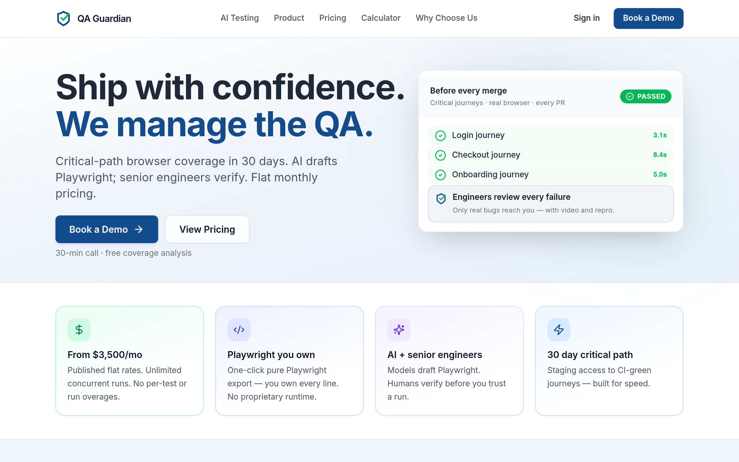
Use human-verified AI testing to validate critical conversion journeys after changing forms, buttons, or checkout flows; the guidance can help your team combine managed QA, end-to-end testing, Playwright, AI testing, and continuous integration rather than relying on a manual spot check.
For measurement, distinguish a form viewed, a form started, a form submitted, and a submission accepted by the business. For checkout, distinguish checkout started, payment attempted, payment approved, order confirmed, and order later cancelled. These events expose technical failure versus customer hesitation.
Worked example: an apparel retailer with expensive paid traffic
Imagine an apparel brand buying search and social traffic to a collection page. Its baseline review shows strong collection-page engagement but a large decline before checkout. Customer support conversations repeatedly mention uncertain delivery dates and difficulty understanding returns on sale items.
The team should not immediately shorten the checkout. The evidence points to earlier uncertainty. A useful sequence would be:
- Add a delivery estimate and returns summary near the product purchase control.
- Make size and fit guidance available without leaving the product page.
- Track product-page shipping interaction, add-to-cart, checkout start, payment attempt, and completed order.
- Compare paid search, paid social, and returning visitors separately.
- Monitor order margin, discount use, returns, and customer support contacts as guardrails.
The hypothesis is: For first-time mobile visitors from acquisition campaigns, showing delivery and returns information at the purchase decision will increase checkout starts by reducing uncertainty, without reducing contribution margin per visitor.
An illustrative starting policy might define a meaningful review after two weeks or after 500 eligible sessions per experience, whichever comes later. Those numbers are not universal benchmarks. Adjust them based on purchase frequency, traffic concentration, seasonality, and the size of the expected effect; if the result swings substantially when one promotion or campaign is removed, the evidence is not yet stable.
The team should also check whether the improvement merely shifts abandonment later. If checkout starts increase but payment completion does not, the next constraint is likely in checkout, payment, total cost, or inventory—not the product-page explanation.
Experiment, interpret, and scale the winners
Testing is a decision process, not a permanent request for more variants. Before launch, document the audience, control experience, change, primary metric, guardrails, run conditions, and decision rule. This protects the team from changing the interpretation after seeing an attractive but noisy result.
Choose the right test method
Use an A/B test when you can expose comparable users to distinct experiences and collect enough outcome data for a useful decision. Use qualitative research or a usability review when the question is comprehension or discoverability. Use a staged release when the change carries technical or operational risk. Use a holdout or geo-based design only when your measurement capability and traffic support the added complexity.
Do not test several unrelated changes at once if you need to know which mechanism drove the outcome. A bundled redesign can be appropriate when the existing experience is fundamentally broken, but then the result answers “is this new system better?” rather than “which change worked?”
Google Ads’ guidance on landing pages emphasizes relevance, usefulness, and the ability for users to complete the expected action. The official landing-page experience guidance is helpful when aligning paid-media quality with the post-click experience, rather than optimizing ads and pages as separate departments.
Use guardrails to prevent false wins
A conversion lift is not automatically a business win. Add guardrails such as:
- Revenue or margin per session
- Qualified-lead or sales-accepted rate
- Refund, cancellation, or return rate
- Average order value and discount rate
- Customer support contacts
- Page performance and technical error rate
An illustrative starting policy is to require a primary-metric improvement to persist across two meaningful audience cuts before broad rollout. Adjust this policy when the audience is intentionally narrow, when the test is designed for a single segment, or when a high-severity defect warrants immediate remediation. The signal for caution is disagreement between the primary metric and the commercial guardrails.
Segment after the main result, not before creating a story. Useful cuts include device, new versus returning visitor, campaign intent, geography, product category, and customer value tier. Avoid presenting every segment that happens to look positive. A segment is actionable when it is large enough to serve, behaviorally coherent, and connected to a plausible mechanism.
Scale the learning into acquisition and creative
Website insights should change more than the website. If visitors respond to delivery certainty, that language can inform ad creative. If qualified leads need proof of implementation support, that proof can appear in prospecting content. If a particular product category converts only after comparison content, media should account for the longer path instead of judging the first visit by an immediate purchase.
This is where digital marketing services connects with conversion work: landing-page decisions, creative strategy, media buying, and performance measurement need a shared commercial objective. The broader marketing expertise can also help teams resolve whether a weak result comes from positioning, audience selection, offer design, or interface execution.
Create an operating cadence that prevents regression
Conversion improvement decays when ownership is unclear. A page can be redesigned by brand, modified by engineering, promoted by media, and measured by analytics without any one team owning the complete outcome. Establish a lightweight operating cadence with a single backlog and explicit decision owners.
At minimum, assign responsibility for:
- Measurement integrity: event definitions, attribution logic, QA, and reporting.
- Experience quality: content hierarchy, accessibility, usability, and visual consistency.
- Commercial quality: margin, lead acceptance, retention, and customer feedback.
- Experiment delivery: hypothesis, implementation, launch, analysis, and rollout.
- Media feedback: audience quality, creative promise, landing-page relevance, and spend allocation.
Run a practical review cycle
Use a weekly review for active tests and major defects, and a monthly review for funnel economics and roadmap priorities. An illustrative starting policy is to reserve one review each month for post-conversion outcomes such as repeat purchase, refunds, qualified pipeline, and margin. Adjust the cadence when the business has strong seasonality or when a high-volume funnel changes rapidly.
Every review should answer:
- What changed in traffic, offer, inventory, creative, or customer mix?
- Where did the largest qualified-user loss occur?
- Which evidence supports the current hypothesis?
- What did the last test teach us, including an inconclusive result?
- What action will be taken, by whom, and by what release date?
Maintain a decision log. Record why a test was launched, stopped, rolled back, or scaled. This prevents the same weak idea from returning six months later under a new label and helps new stakeholders understand the limits of past evidence.
Protect the customer journey after launch
Regression monitoring matters because conversion paths depend on code, inventory, payment providers, consent settings, browser behavior, and campaign destinations. Set alerts for sudden changes in key events, but investigate before reacting to every fluctuation. A tracking outage can resemble a conversion collapse; a promotion can resemble a product improvement.
Use a simple release checklist:
- Confirm the intended audience and traffic routes.
- Verify analytics events in the live environment.
- Complete the journey on major device and browser combinations.
- Check accessibility, error recovery, and page performance.
- Confirm price, shipping, tax, inventory, and promotional logic.
- Review the primary metric and guardrails after release.
- Document the result and the next decision.
Start with one measurable bottleneck this week
Do not begin with a site-wide redesign or an endless test backlog. Begin by choosing one commercially important journey—such as a paid-media landing page to checkout, or a lead form to sales acceptance—and map every step from qualified visit to business outcome.
Then complete these actions in order:
- Write the primary conversion, secondary events, quality signals, and guardrails.
- Pull the funnel by source, device, landing page, and new versus returning status.
- Pair the largest qualified-user loss with customer, sales, or support evidence.
- Write one mechanism-based hypothesis.
- Ship the smallest change that can test that hypothesis safely.
- Validate the full journey, measure commercial outcomes, and record the decision.
If your team cannot agree on the primary conversion or cannot connect website actions to revenue quality, fix measurement before increasing media spend. Kimmel Marketing can help connect brand strategy, creative, media buying, and performance optimization through Kimmel Marketing, with the website treated as part of the growth system rather than an isolated design project.
Authored with NotFair SEO